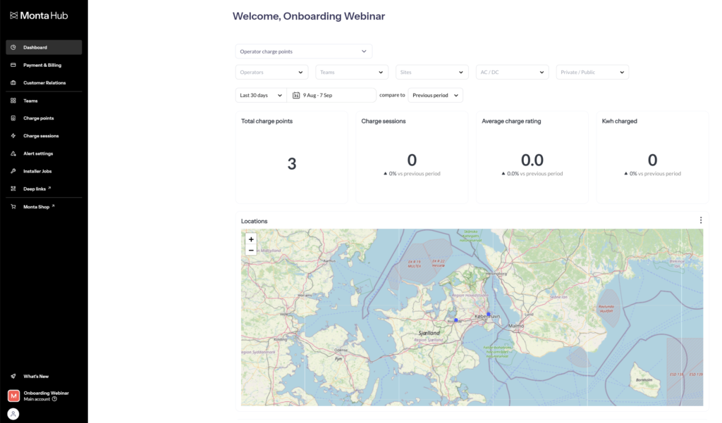
Operator dashboards in Monta give you insights into your network, charge points, revenue, invoices, roaming activity, failed sessions, and utilization. They are designed to help operators monitor performance, track financials, and quickly identify issues.
You can switch between different dashboard types using the dropdown at the top of the dashboards page. Each dashboard has its own focus area and can be filtered by operators, teams, sites, charging types (AC/DC), and access level (public/private).
The Dashboards are available to Operator users.

Operator Charge Points
The Operator charge points dashboard provides insights into the distribution and usage of charge points.
Tables:
- Teams – Lists all teams with total charge points and charge sessions for the current month.
- Sites – Displays sites with total charge points and charge sessions.
Charts:
- Roaming / non-roaming split – Share of roaming-enabled charge points.
- Charge points – New vs total charge points over time.
- Charge sessions – Completed sessions and accumulated totals.
- Charge ratings – Average ratings from users.
- kWh charged – Energy delivered over time.
- Active / inactive split – Percentage of active vs inactive charge points.
- Public / private split – Breakdown of access levels.
Operator Revenue
Revenue Over Time:
- A bar chart showing revenue by month.
- Helps identify trends and seasonal peaks or drops.
Running Revenue Over Time:
- A line chart adding up revenue month by month.
- Shows your total accumulated revenue across the selected period.
Tables:
- Operators – Revenue totals per operator for the current and past months.
- Paying Teams – Teams contributing revenue, with columns for team name, operator, current month, and total revenue.
- Plans – Linked subscription plans, showing plan name, number of subscriptions, and active subscriptions this month.
Filters:
At the top of the dashboard, you can filter by:
- Operators
- Paying Teams
- Plans
- Date range (monthly or yearly)
- Currency
Use this dashboard to monitor financial health, track paying teams, and manage subscription-linked revenue.
Operator Team Revenue
The Operator team revenue dashboard shows revenue performance broken down by team.
Charts:
- Revenue over time – Monthly breakdown of fees, charges, write-offs, inter-company transfers, and tax refunds.
- Running revenue over time – Cumulative revenue trends.
Tables:
- Teams – Operator teams with revenue for the current month.
- Paying teams – Lists paying teams, their operators, and total revenue.
Operator Invoices
The Operator invoices dashboard tracks the billing status of invoices issued to teams and operators.
Key metrics:
- Paid invoices
- Settled invoices
- Unpaid invoices
Table:
- Includes:
- Operator
- Parent operator
- Customer (team or operator)
- Invoice ID
- Status (paid, settled, unpaid)
- Wallet ID
- Currency code
- Wallet balance
- Due at
- Days overdue
- Payable Amount
- Period from
- Period to
Operator Roaming Charges
The Operator roaming charges dashboard shows performance and revenue for roaming sessions.
Key metrics:
- Total charge sessions
- Total kWh charged
- % successful sessions
- Total charge revenue
Additional insights:
- Charge point locations – Map of roaming activity.
- Roaming providers – Breakdown of connected providers.
- Paying operators – Operators involved in roaming.
KPIs over time:
- Charts for successful sessions, revenue, charge sessions, and kWh delivered.
Operator Failed Charges
The Operator failed charges dashboard helps identify and analyze failed charging sessions.
Key metrics:
- Total charge sessions – With % failed sessions over time.
Breakdowns:
- By operator, team, site – Where failures occur.
- By firmware, brand, model – Technical breakdown of affected hardware.
- OCPP errors – Error codes linked to failures.
Operator Site Utilization
The Operator site utilization dashboard benchmarks site performance against Monta’s industry-wide data.
Industry benchmarks:
- Top performance (kWh/CP/day): >220
- Great performance (kWh/CP/day): >150
- Poor performance (kWh/CP/day): <20
- Top performance (% time utilised): >20%
- Great performance (% time utilised): >15%
- Poor performance (% time utilised): <5%
Site performance:
- Site utilisation chart – Compare sites against benchmarks.
- Average site utilisation (kWh/CP/day) – Efficiency per charge point.
- Average daily utilisation (% time) – Share of time charge points are in use.
Network Overview
The Network Overview dashboard shows the current health of your charge point network and any ongoing incidents.
Key metrics:
- Total charge points – Overall number of charge points in your network.
- Disconnected / Error / Maintenance – Breakdowns of unavailable charge points.
- Total unavailable – Count of charge points contributing to downtime.
- Most impacted teams – Ranked list of teams, sites, and charge points with the highest number of unavailable charge points.
- Trends over time – Line graph showing the percentage of time spent in downtime (Disconnected, Error, Maintenance).
- Charge Session failure rate:
- Most impacted teams – Ranked list of teams, sites and charge points with the highest percentage of unavailable failed charge sessions.
- Trends over time – Line graph showing the percentage failed charge sessions for past 24h, 72h, 7 days and 30 days.
- Failed charge sessions – Failure rate percentages for the last 24 hours and 30 days.
- Incident alerts:
- Total open alerts – Active issues in your network.
- Priority levels – High, medium, and low priority alerts.
- Most impacted teams/Sites/charge points/Alert reasons – Entities with the highest number of alerts.
- Trends over time – Chart of alert activity.
